Tipo de Conteúdo
Perfis
Fóruns
Eventos
Galeria
Downloads
Loja
Classificados
Community Map
Tudo publicado por Tozé Nunes
-

Desafio de aquascaping aquariofilia.net - 3° edição
Tozé Nunes respondeu a Tozé Nunes num tópico de EVENTOS E CONCURSOS
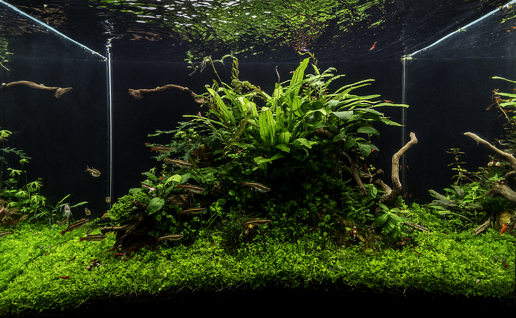
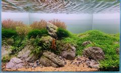
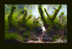
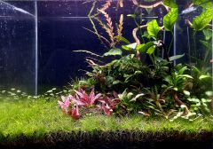
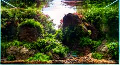
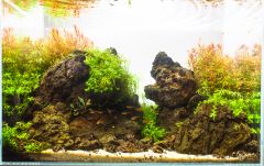
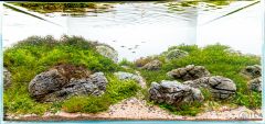
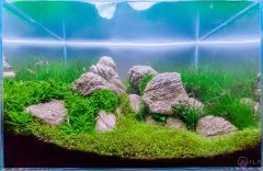
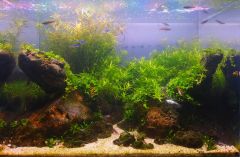
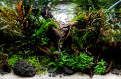
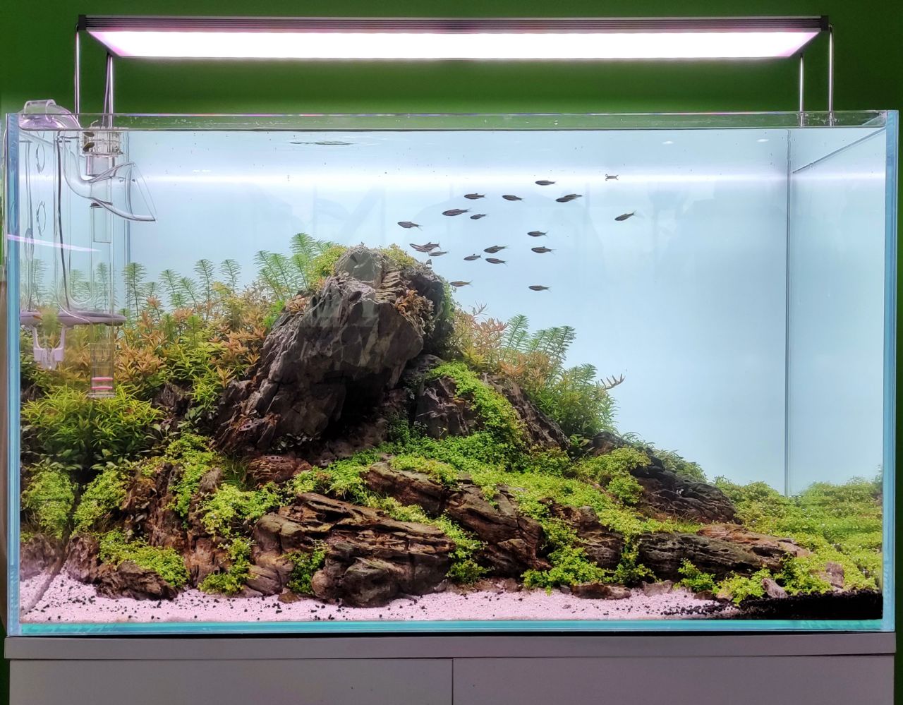
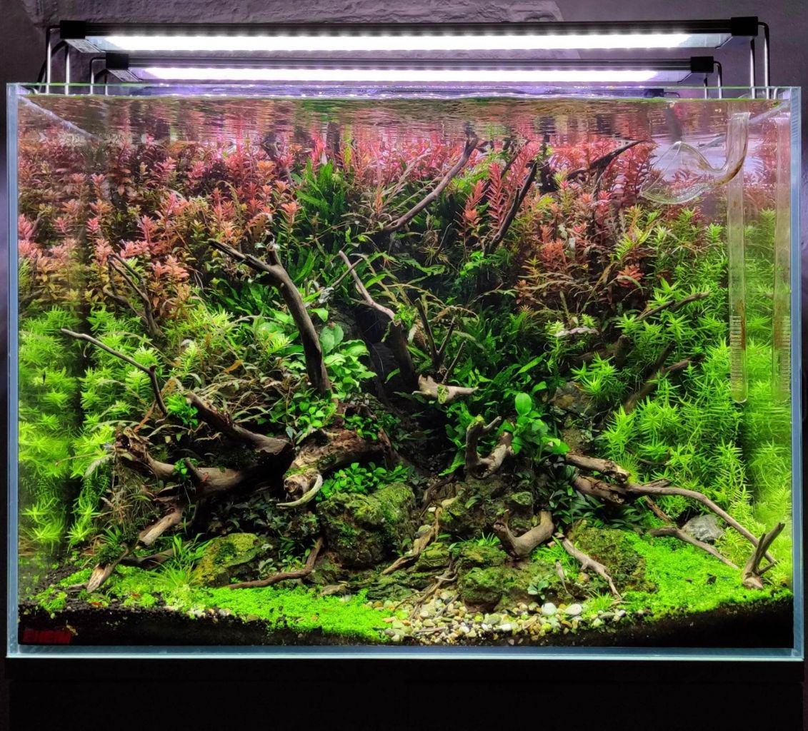
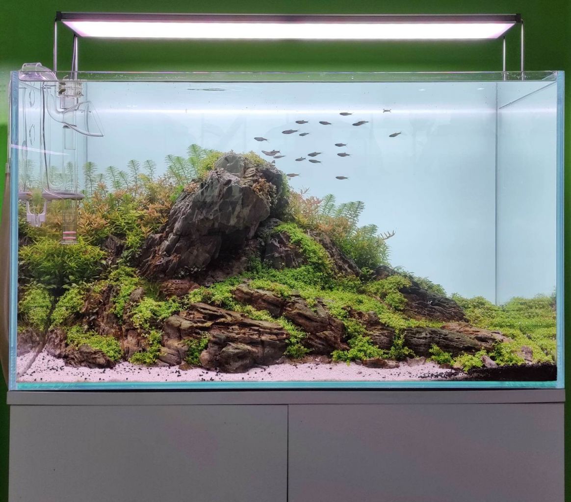
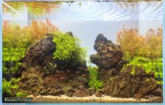
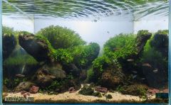
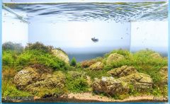
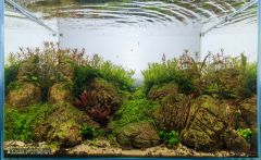
E finalmente temos a classificação dada pelos nossos prestigiados Juízes e mais importante, os seus comentários que muito vão ajudar os nossos aquascapers a melhorar as usas montagens. Segue então as fotos enviadas por cada aquascaper e respectivas avaliações e comentários : João Abóbora 60 I like the fish and most plant choices, it just feels like it needs more time; probably because the tank is young and these species are slow. I would also try to make the main rock less square with us the viewer. Steven Chong 43 Equipment science and love You have to keep motivated Hootan Maftoonian 70 Matthew Manes 40 For this aquarium I would advise other types of plants, some of the selected ones are too large for such a small aquarium, and I would also choose a better time to take the photograph, the water looks a bit cloudy. Balbi Vaquero 25 Michal Adamek Total Score:238 João Pedro Palma 70 I love the foreground and midground plant choices, and you've done an awesome job with those crypts in such a short time. This could be a very nice old-school-style Nature scape, triangled top right back down to bottom front left corner. Need some more strong wood work though along that axis, and the anubias should be swapped out for some tape like plants. I would go with some crinim, along with Eriocaulon feather duster and maybe some val nana for something like that. Steven Chong 58 it is so beautiful I like this tank overall It is necessary for photography, such as removing the equipment and cleaning the glasses Hootan Maftoonian 74 Matthew Manes 50 I would have liked to see something more of a hardscape, in aquariums with such little time for the development of the plants it is always better to start from a good structure, since time is limited and the plants are not fully developed, but surely in a few months it will be a totally different aquarium Balbi Vaquero 20 Michal Adamek Total Score: 272 Bruno Carvalho 70 It's pretty clear to see the intent behind this layout, but the upward angling rocks need a bit more finesse, need a bit more work to have the right size for impact and a sense of leaning or fitting to something to keep them in position. They feel a bit unnatural now. It also looks like the scaper wasn't able to grow anything in their shadow effectively. Choosing plant placement is important-- I recommend Susswassertang to layouters who have a dark spot where nothing else will grow. Steven Chong 51 This tank needed more time Hootan Maftoonian 75 Matthew Manes 55 You can really see intention and I appreciate the details of the hardscape, but you should be more careful with pruning, the bunch of rotala as it is takes away a lot, I would advise choosing a better time to take the picture in the future. Balbi Vaquero 25 Sadly, too fresh aquarium. In a couple of months it could look much cleaner. Michal Adamek Total Score: 276 Ricardo Correia 74 All the elements are there, I think this work just needs a bit more time to grow in. One reason it might feel less developed despite all layouts having the same time is that there is a bit too much rock, a bit too little space committed to plants; which you really need in styles dependent on stem plants. A bit too many rocks, and a bit too little contrast in rock size have an effect of making a layout feeling "stuffed" or under-planted. Steven Chong 65 A good work It would be more beautiful if the rotalas were higher You should be more careful about the size of the plants and their placement in the plan Hootan Maftoonian 80 This one can be beautiful but it's lack of execution, also it need more time for plants to grow most specially the stem plants. Congratulations Matthew Manes 72 A very well planned aquarium I really like the hardscape, but it lacks time for the development of the plants. Balbi Vaquero 45 Aquascape is much too symmetrically arranged. I miss the depth. Congratulations to Otocinclus for being the master of the third plan. Michal Adamek Total Score: 316 Vasco Ferreira 80 Quite the interesting work! I like the "speed" the Utricularia give with their direction, and it's heightened by the angles of the rocks. It gives me ideas for how to do a stream-themed aquascape in a small aquarium like this. That said, while the plants are looking great, the rocks do not feel well incorporated to the work-- a bit too clean and stark white. Since I think I see some algae in the Utricularia, maybe the rocks were scrubbed a bit too much? Anyway, some better contrast of small and big rocks, and use of shadows would also help in composition and in blending rock/plants together. Sharper fragments would also better improve the feeling of "speed." Steven Chong 66 It is natural and beautiful It conveys a very good feeling The height of soil is high in the foreground. Congratulations Hootan Maftoonian 81 Plants are healthy and I love the stone but you need to study more on hardscape, congratulations Matthew Manes 65 Nice aquarium I always like to see an Iwagumi, good selection of plants, but I miss a more delicate work on the lines of the rocks, in some parts the structure lacks harmony, nothing that cannot be easily fixed. Congrats!!! Balbi Vaquero 25 Very poor photo. If one would work on the shooting technique it would be definitely better. Sadly a bad shape of the plants. Michal Adamek Total Score: 317 André Batista 75 Nice overall composition. I think the wood is a bit too fluffy-- like a stuffed animal's arm. I like Susswassertang as a plant, but for this you really want a true moss. Also not covering all wood, but bits with good balance. Making all the rocks smaller might add scale as well. Steven Chong 63 It is beautiful, I know very well that the jungle tank is difficult to maintain Hootan Maftoonian 78 Matthew Manes 68 Very good work, it is seen that there is a lot of work on the details, the only thing to highlight is that the moss is too wild, it would need a bit of trimming. Balbi Vaquero 35 Forest scape, too bad the plants weren't trimmed more. It does not look like a wild jungle or forest. Sadly very chaotic Michal Adamek Total Score: 319 Tozé Nunes 84 What interesting rocks with wonderful texture… overall the plants look to be in good shape for the time the layout's been up as well. I think there needs to be more dedication to heighten the main elements though. The big stone on the left takes too much weight/space when it is the main rock on the right side that needs to be the focus. Other rocks need shadows and break up of negative spece in order to make the main rock really the focus. Steven Chong 62 I like this hardscape , keep it up, you made a beautiful tank Hootan Maftoonian 84 Composition wise but plants is not healthy and need more time to grow, also avoid the soil to make visible on white sand, congratulations Matthew Manes 60 Nice tank, it needs a bit of time to be the way it should be... As a tip, I would keep the sand in the front a bit finer, especially on the left side. Balbi Vaquero 40 Beautiful composition of rocks in the foreground. The only thing missing was the rocks in the background. It would have created a beautiful depth. Michal Adamek Total Score:330 Carlos Carvalheira 80 A wonderful little Nature Aquarium. I think this would be strengthened with greater contrast in rock sizes. Right now all rocks are in the same range of size, but small pebbles are needed to make big rocks BIG, and the big focal rock(s) should be bigger. This will give you better contrast and scale. Steven Chong 70 The quality of the plants is good. I like this nano tank. You could write a romantic ending to your story Hootan Maftoonian 82 Plants is in good condition but I think it need more time to grow better for the stem plants. One thing I noticed plants must be equal if you have in the left it must be on the right also additional moss on rock would be nice additional details too. Congratulations Matthew Manes 75 A really healthy aquarium, and a great photograph, but it lacks time to be as it should, but I would love to see this aquarium in about three months, it is a very nice aquarium Balbi Vaquero 65 Plants could be trimmed more frequently. A near-classical arrangement. Enjoyable looking scape. Michal Adamek Total Score: 372 Vera Santos 87 If the contest was just a demonstration of skills, I think this layout would be the clear number 1. Use of space front to back left and right, use of contrasting sizes of rocks, use of proportion and scale, even light and shadow contrast… even the refinement of the foreground sand and plant trimming, it all demonstrates the layouter's skill. To reach the next level though, you need more of an expression of emotion. Make the judges go-- "hoh.. interesting..." I think one easy improvement is to fix the fact that right now everything has about the same light-dark balance, which actually makes it feel flat. Every individual piece of the work looks great, but in total it feels flat because there's no clear bright place in the midground. The other thing is that the father stone needs to be handsome, with some minor bright details that show a "face" even in the shadow portion. Without this , the most important stone also feels flat. Overall, an excellent scape that shows the layouter's advanced skills. Steven Chong 83 I like the combination of light and shadow in this work The choice of fish can be better Also, Anubias on the right side was not suitable for this design, it is very beautiful in general Hootan Maftoonian 86 When you look at clearly the details is amazing but some area is too messy, you need to practice more on trimming your stem plants to grow more beautiful and be bushy. Congratulations Matthew Manes 85 Incredible way to use the space available in this small aquarium, I can say little more about this aquarium, nothing that time won't fix, really a very nice aquarium. congrats!! Balbi Vaquero 65 At the same time mysterious and peaceful work! Very well executed aquascape Michal Adamek Total Score:406 Ricardo Galante 78 Health plants, good refinement of elements of lines-- there is a lot to find admirable in this scape. But in composition, I think you need to commit firmly to being a directional triangle scape, or Convex Brazilian-influenced. Also all rocks being the same size affects the layout's scale, depth, impact. Overall though, great work. Steven Chong 77 Its beautiful The end part needed a little more attention, the reflection on the sides has been used beautifully Hootan Maftoonian 87 I love how the plants grow here but I don't like how the moss placement it didn't integrate to the layout and the stone placement is too messy. I don't see any good flow and you need to put some plants on the sand to create details then you must add fauna on the scape, and you need some trimming on the stem plants at the back. Congratulations Matthew Manes 70 Clean and healthy, that would be a good way to describe this aquarium, very good selection of plants, perhaps the back would need a little more time to achieve the desired effect. Congratulations, it's a very nice aquarium. Balbi Vaquero 95 This layout gives a pleasant feeling of peace. It's nice to see a photo that doesn't have artificially saturated colors. An insanely well executed nano aquascape. Really good job! Congratulations. Michal Adamek Total Score:407 Kire Hajba 88 I think this layout best demonstrates the core of what we want to see from high level layouts-- a strength of presentation, drama, emotional presence. There is a use of composion, of shadows and lines, of front and back, that shows a high awareness of the craft. The layout does need more refinement, and a bit more effective use of negative space in the midground, and trimming the Pinnatifida into a more "trained" state would really elevate the work. Importantly though, it presents itself in the form of a finished work, and that itself is important in a contest. Steven Chong 76 This work shows the creativity of working with wood But the selection of plants and the size of plants for this design could be better. Hootan Maftoonian 90 Beautiful nature style, I love the shadow of this scape and plants are very healthy but still there's many things needs to improve, first the composition is not too visible, next you need to add more plants on the ground,finnatifida is too messy you need to trim it, also I noticed I don't see any present of faunas Matthew Manes 80 Incredible the good evolution of this work really well used the measure of the aquarium, it lacks some order but taking in consideration the time they have been really healthy. Balbi Vaquero 85 Great space management skills in a nano aquarium. Good shadow ratio. It would be worth trimming hygrophila pinnatifida more often, it should have smaller leaves, in this particular case. Michal Adamek Total Score: 419 Rodolfo Provenzano 83 In a contest between Portuguese aquascapers, I expected to see some strong examples showing influence from the Brazilian style, and wasn't disappointed. This is probably the strongest of that style, with excellent composition, proportions, and good refinement of plants and sand. I think the easy points for improving the work would be (1) to better tweak the rock angles to get some shadows-- right now it's all flat tone, with no dark/light use. (2) Use a zig-zag path instead of a straight one. If the sane path zigged left into where the Dow-noi is and the right and then left again, the layout would have much more movement and dynamism; that movement is what's needed to creat the IMPACT of the Brazilian style. Steven Chong 88 The stones are carefully and beautifully worked It has given good depth to the work, more shadow could have made the work more professional. Congratulations, it is very beautiful and I admire it Hootan Maftoonian 94 I really love this tank it gives me a tranquility feeling, the plants is also healthy, the choice of fish and position complement the whole idea, congratulations to the autor Matthew Manes 90 A very well structured work, and with very good forecast in the times of growth in the plants. To highlight above all how well played the reflexes are without a doubt they give another dimension to the tank. Congratulations, it is a beautiful aquarium! Balbi Vaquero 75 Photo taken with a very wide angle lens, but still an impressive layout nonetheless. Beautiful reflections. I would say that Scaper managed to achieve a good depth illusion. Bravo! Michal Adamek Total Score: 430 -
From the album: Desafio de aquascaping aquariofilia.net 3° edição
© Aquariofilia.net
-
From the album: Desafio de aquascaping aquariofilia.net 3° edição
© Aquariofilia.net
-
From the album: Desafio de aquascaping aquariofilia.net 3° edição
© Aquariofilia.net
-
From the album: Desafio de aquascaping aquariofilia.net 3° edição
© Aquariofilia.net
-
From the album: Desafio de aquascaping aquariofilia.net 3° edição
© Aquariofilia.net
-
From the album: Desafio de aquascaping aquariofilia.net 3° edição
© Aquariofilia.net
-
From the album: Desafio de aquascaping aquariofilia.net 3° edição
© Aquariofilia.net
-
From the album: Desafio de aquascaping aquariofilia.net 3° edição
© Aquariofilia.net
-
From the album: Desafio de aquascaping aquariofilia.net 3° edição
© Aquariofilia.net
-
From the album: Desafio de aquascaping aquariofilia.net 3° edição
© Aquariofilia.net
-
From the album: Desafio de aquascaping aquariofilia.net 3° edição
© Aquariofilia.net
-
From the album: Desafio de aquascaping aquariofilia.net 3° edição
© Aquariofilia.net
-

Lista de lojas de Aquariofilia em Lisboa
Tozé Nunes respondeu a HomemPeixe num tópico de PRIMEIROS PASSOS
Podes ver aqui as que estão listadas e conforme as vás visitar podes também fazer a tua avaliação. https://www.aquariofilia.net/forum/companies/ -

Desafio de aquascaping aquariofilia.net - 3° edição
Tozé Nunes respondeu a Tozé Nunes num tópico de EVENTOS E CONCURSOS
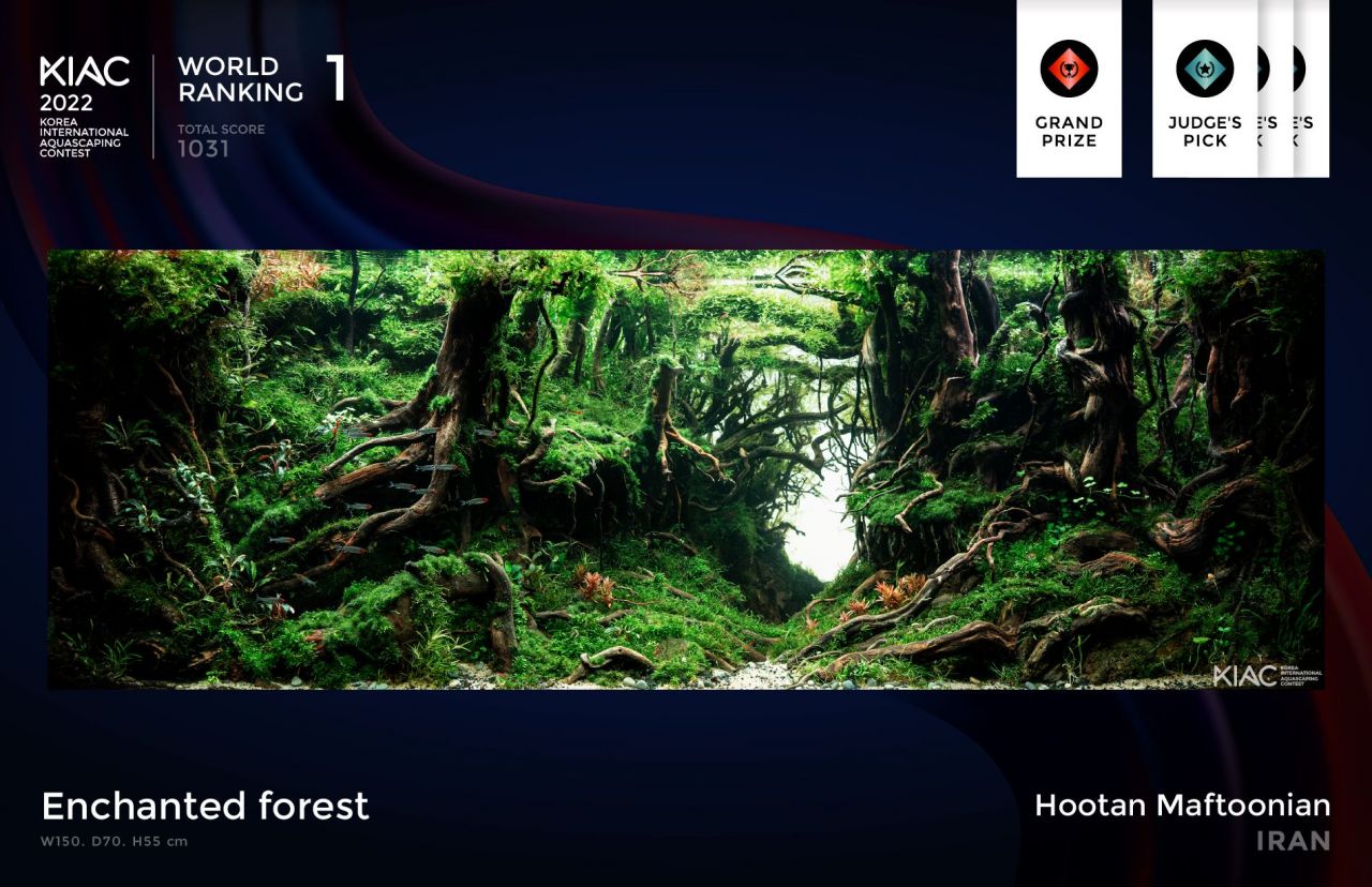
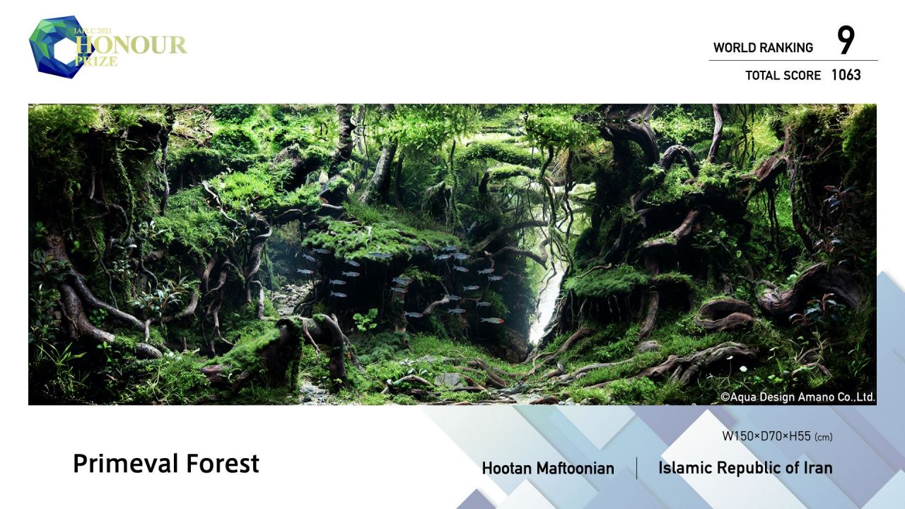
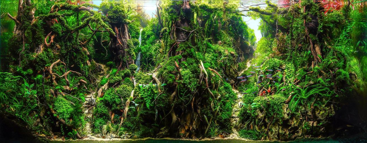
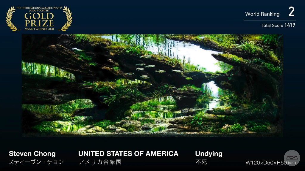
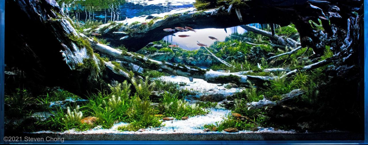
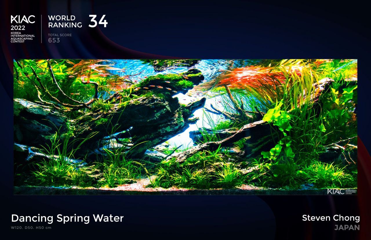
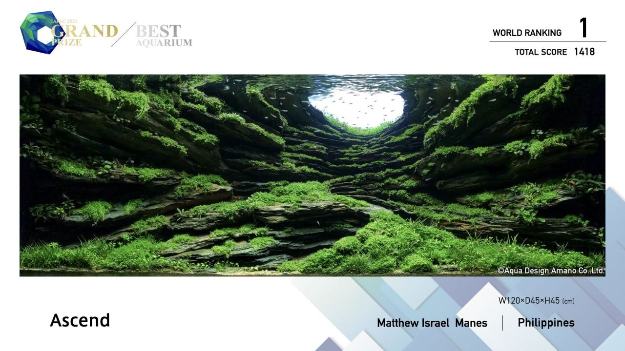
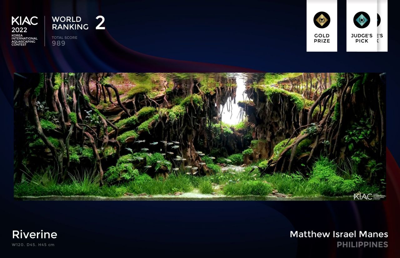
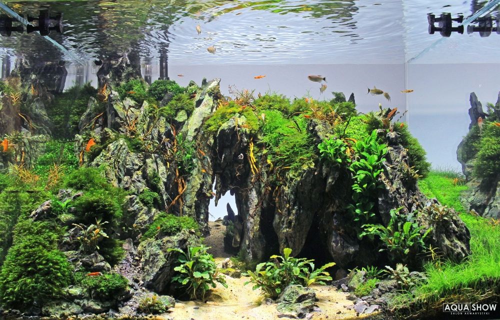
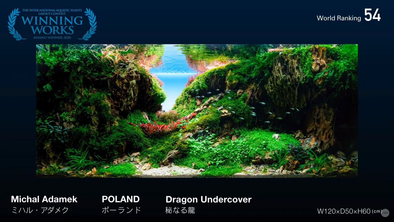
Para quem não está familiarizado com os nomes dos juízes desta terceira edição do desafio de aquascaping aquariofilia.net e o que eles representam no aquascaping mundial segue uma breve descrição : O iraniano Hootan Maftoonian, veterinário de profissão que adora a arte, desde 1991 que trabalha no campo da aquacultura ornamental e há seis anos atrás foi encorajado a se tornar um profissional de aquários plantados. As suas participações em concursos internacionais começaram em 2019 logo com resultados altos para o ano passado atingir a glória com diversos prémios internacionais: Kiac south korea 2022 grand prize rank 1 Enchanted forest __ USA Seascape _ seachem contest 2022 Grand prize rank 1 Enchanted forest __ IIac Taiwan: 2022 rank 17 2021 rank 37 2019 rank 37 _ Iaplc japan 2022 rank 9 _top ten Primeval forest 2019 rank 140 If the planet dont warm __ Aga 2022 320l Top 10 __ Rflac turkey 2022 Rank 4 2021 Rank 14 _ Cbap brazil 2021 rank 28 2022 rank 4 _ Ciac china 2019 rank 13 Pelas suas criações podemos apreciar que a sua especialidade são os layouts tipo florestas. Excelentes criações! Por sua vez o Steven Chong, aquascaper profissional, membro do grupo japonês Tokyo Aquascaping Union (TAU) e do americano The Aquascaper's Colletive (TAC), Tem deslumbrado nos concursos internacionais onde já nos habituou a montagens sempre criativas atingindo lugares de topo nos principais concursos internacionais: IAPLC - Rank 2 (2020), Rank 5 (2018), Rank 15 (2019), Rank 37 (2021) IIAC - Rank 34 (2019), Rank 38 (2022) AGA - Rank 2 (2020, 2021, 2007), Top 10 (2018, 2019, 2022), Most Innovative Award (2018, 2020) Fantástico! E que dizer do filipino Matthew Manes? Em 2022 conseguiu a proeza de arrebatar o primeiro lugar no IAPLC, IAAC e AGA! IAPLC (JAPAN) - Rank 1 (Grand Champion + best of aquarium) - 2022 - Rank 5 (Bronze prize) - 2021 IIAC (TAIWAN) - Rank 1 ( Grand champion) - 2022 - Rank 30 - 2021 - Rank 21 - 2021 KIAC (KOREA) - Rank 2 ( Gold prize) - 2022 CIAC (CHINA) - Rank 20 - 2019 - Rank 12 - on china live international Aquascaping Competition (I represent Philippines) - 2019 SHC (Germany) - Rank 1 ( Grand Prize) - 2022 AGA (USA) - Rank 1 + best of show on 220 - 320L category 2021 - Rank 2 on smaller than 28L category 2018 - Rank 2 on 28L — 60L category 2018 - Rank 1 on smaller than 28L category 2017 RFLAC (TURKEY) - Rank 7- 2022 CBAP (BRAZIL) - Rank 1 ( Grand prize) international category 2021 - Rank 1 ( Grand prize) international category 2022 Mini swamp wabi kusa (Europe) - Rank 2 - 2018 Que brutalidade de aquários! O Michał Adamek (30 anos) é um dos aquapaisagistas mais conhecidos da Polônia. Co-proprietário do Aqua Show, é um orgulhoso membro do Aquaflora A-Team. Desde o início de 2015, sempre esteve muito entusiasmado com a cena do Aquascaping, promovendo-o nas redes sociais e várias plataformas e agora representando seu país natal, a Polônia, em competições internacionais! Em 2018 foi o primeiro polaco a se classificar e participar do CLIAC 2018, competindo com os melhores aquapaisagistas de todo o mundo em um evento ao vivo O grande avanço para ele foi em 2019, vencendo o Magdeburg “TAoPA” e o “Aquaflora Nano Aquascaping Contest” durante o Vivarium Event, além de ficar em segundo lugar no EAPLC. A entrada de Michał, intitulada "The Realm of Dragon Rocks" conquistou um saudável 14º lugar no concurso CIAC 2019, o que lhe deu o direito de passagem para participar mais uma vez no CIPS 2019 Shanghai, China, pela segunda vez consecutiva, e levou um muito orgulhoso do 4º lugar dos principais competidores de todo o mundo! Michał adora compartilhar seus conhecimentos e experiências com todos, especialmente os recém-chegados ao hobby, pois sua paixão transparece ao falar com indivíduos ou grandes grupos. Ele humildemente afirma que nas competições nunca se trata de prêmios! O ponto principal de sua jornada de paisagismo são as pessoas incríveis que ele conhece e o privilégio de criar mundos subaquáticos para todos desfrutarem. E finalmente a Balbi Vaquero. Espanhola, 43 anos nascida em Barcelona que desde que atingiu a maioridade começou a trabalhar em lojas especializadas em aquariofilia. Em 2009 descobriu o mundo fantástico do aquascaping e a partir daí o desejo de cuidar das plantas não parou de aumentar, tendo a felicidade de hoje fazer parte da Aquaflora. Na sua longa carreira contam-se as participações enquanto juíza no IIAC, CIAC, CLIAC,CBAP, Indo Scaper Race, AGA, ANAC e EAC. -

Dragon Valley - Already labeled :D
Tozé Nunes respondeu a Carlos Carvalheira num tópico de AQUASCAPING
Gosto do pormenor dos vasos 🤦 -
Falta pormenor na transição entre as rochas e a areia. Uns calhaus pequeninos para quebrar essas linhas certinhas e um areão para prenencher entre as rochas e a areia ia criar mais destaque. Aquela moita vermelha no canto esquerdo é resultado de uma poda invertida?
-

Desafio de aquascaping aquariofilia.net - 3° edição
Tozé Nunes respondeu a Tozé Nunes num tópico de EVENTOS E CONCURSOS
Temos o privilégio de anunciar que a espanhola Balbi Vaquero, o iraniano Hootan Maftoonian, o polaco Michal Adamek, o americano Steven Chong e o filipino Matthew Manes vão avaliar e comentar os doze aquários que fazem parte da terceira edição do desafio de aquascaping aquariofilia.net!!! Assim que tenhamos todas as pontuações e comentários publicaremos e celebraremos o novo campeão do desafio. -
Estás contratado! Pago uma bifana! 😉
-

Desafio de aquascaping aquariofilia.net - 3° edição
Tozé Nunes respondeu a Tozé Nunes num tópico de EVENTOS E CONCURSOS
Post anterior editado, faltava os comentários feitos pelo Nuno ao vivo na Petfestival. Qual é? Para a próxima edição posso contar com a tua participação? -

Desafio de aquascaping aquariofilia.net - 3° edição
Tozé Nunes respondeu a Tozé Nunes num tópico de EVENTOS E CONCURSOS
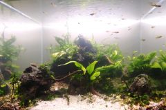
Já desde uns dias antes de os aquários terem sido levados para a Petfestival, fazia parte das regras até porque andar com tudo de um lado para o outro implica vários riscos para o layout como bem demonstraram a queda de umas rochas que se descolaram no aquário do Bruno Carvalho e o levantamento do tapete de UG no do Vasco! Voltando às fotos "finais" estas estão ainda a ser avaliadas por nomes conceituados do aquascaping mundial! Assim que tenhamos as avaliações todas as fotos serão publicadas aqui e nas nossas redes sociais. Enquanto isso, ficam aqui as fotos tiradas durante a Petfestival pelo Nuno Matos @Nuno M. que além disso também as avaliou e comentou (em itálico): Julgamento in-loco petfest 2023 de notar que poucos aquários têm fauna consistente por se encontrarem em ambiente de feira um layout que com um pouco mais de detalhes (plantas) poderia ascender a outro patamar, o plano frontal fica marcado logo por rochas muito grandes que ocupam muito campo visual e primeiro impacto. Demonstra dificuldade na manutenção tanto a nível de limpeza quanto a nível de podas. layout rochoso com bastante potencial, bem preenchido com grande sentido de escala, falha completamente na saúde das plantas e limpeza geral. Pena pois tem muito potencial. bonita composição de rochas, mas falha em termos de escala do layout, nota-se dificuldade na saúde e forma das plantas. bonita composição com rocha, boa escolha de plantas apesar de não apresentarem a sua melhor forma, algumas plantas com atrofio de crescimento, o plano frontal necessitava de algumas rochas de menor dimensão. composição com rocha interessante, bons apontamentos com plantas bem escolhidas, peca por falta de cuidado ou timing de poda. um aquário bonito low-tec sem grande preocupação com o layout, peca pelos seus planos traseiros muito abertos. layout triangular mostra boa saúde nas plantas, layout básico mas muito agradável de se observar pela saúde geral e fauna. composição bem conseguida, peca pela escala das plantas e demasiada densidade, um trabalho mais cuidado de tesoura poderia agregar bastante mas no geral gosto do jogo de sombras e escala. o aquário onde as plantas demonstram mais saúde, bela composição de rochas com um efeito de profundidade muito bom tendo em conta a dimensão do aquário aquário bem cuidado, plantas com bastante saúde, bons detalhes no primeiro plano conseguindo domar as plantas para a dimensão certa. Peca por ter o lado esquerdo muito aberto, mas entendo que seja opção. composição em estilo iwagumi muito harmoniosa, excelente escolha de plantas, peca nas junções entre hardscape no plano mais frontal, poderia ter usado estrategicamente algumas plantas para corrigir. diorama com traços muito interessantes, bom domínio de hardcape e profundidade, bom nível de pormenores, peca pelas plantas de moita com pouca definição e os musgos apesar de bem colocados precisavam de mais cuidado. -
From the album: Desafio de aquascaping aquariofilia.net 3° edição
© Aquariofilia.net
-
From the album: Desafio de aquascaping aquariofilia.net 3° edição
© Aquariofilia.net
-
From the album: Desafio de aquascaping aquariofilia.net 3° edição
© Aquariofilia.net
-
From the album: Desafio de aquascaping aquariofilia.net 3° edição
© Aquariofilia.net
.png.93acdf700c71fff95a5ed5a70cc6c4d0.png)

