13 Jorge Laranjeira.jpg
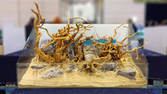
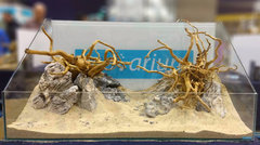
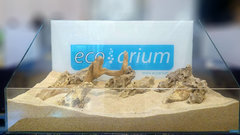
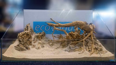
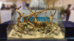
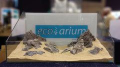
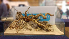
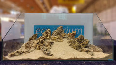
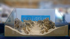
Slightly wild rock work, the branches seem to be all the way in the back, leaving no space for background planting - Jurijs
Rank 2 is a bit more complex, at first it seems like all elements are pushed in to one visual plane at the back, but when you see it closely one can see how the background has been work to a height that gains a good depht of field effect, the elevation of susbtrate from the foregroud to background has been worked very well , and elements are also in a good proportion of the tank size, the space left for steam plants at the back is very little but still it can be arranged. What I liked the most is how the aquascper tried to send the interest of the eye to a focal point of the left, breaking and avoiding monotonus lines. - Bernardo Salas Perez
From the album:
Concurso de Hardscape Petfestival 2018
· 24 images- 24 images
- 0 comentários
- 0 image comments


Recommended Comments
Não há comentários para mostrar
Join the conversation
You are posting as a guest. If you have an account, sign in now to post with your account.
Note: Your post will require moderator approval before it will be visible.